
Entries from May 1, 2016 - May 31, 2016
UK inflation firming, NLW curbing labour demand
 Simon Ward
 Post a Comment
UK consumer price inflation fell in April because of Easter timing effects but the trend in both headline and “core” rates remains up.
Easter fell in March this year versus April in 2015. Some prices (e.g. air fares) rise around Easter so this timing difference boosted annual inflation in March this year, with a corresponding undershoot in April. The best guide to the trend is an average of the two months – 0.4% for headline CPI inflation and 1.4% for the “core” rate excluding energy, food, alcohol and tobacco. These numbers compare with lows of -0.1% and 0.8% in September and June 2015 respectively.
In addition to the Easter effect, April inflation was depressed by a fall in social housing rents, which reflects the decision announced in the summer 2015 Budget to reduce such rents by 1% per annum over the next four years. The annual rise in total rents fell from 2.9% in March to 1.9% in April, subtracting 0.1 of a percentage point from headline and core inflation.
The CPI understates current inflation because it omits owner-occupiers’ housing costs. The CPIH index includes such costs measured using the “rental equivalence” approach – they are estimated to have risen by an annual 2.2% in April. Core CPIH inflation averaged 1.5% in March / April – see first chart.
The retail prices index (RPI) uses a different approach to measuring owner-occupiers’ costs, incorporating house prices via a depreciation component. Core RPI inflation (i.e. excluding mortgage interest costs as well as energy, food, alcohol and tobacco) was 3.0% in March / April, up from a low of 2.4% in April 2015 – first chart. The core RPI rate, that is, is above the former (pre-2003) 2.5% target for RPIX inflation.
Labour market data, meanwhile, confirm some moderation of demand for workers in early 2016 but this may reflect the introduction of the national living wage rather than an economic slowdown, whether due to Breferendum uncertainty or other factors. The number of employees has stabilised since end-2015, while the stock of unfilled vacancies has fallen slightly – second chart. A breakdown of vacancies by size of firm, however, shows that most of the decline has occurred in businesses employing fewer than 10 people; vacancies have been stable among employers of 250 plus. This is suggestive of a living wage effect – smaller firms may be less able to absorb higher wage costs, while a generalised economic slowdown would be expected to reduce labour demand across all firm sizes.
Global narrow money hinting at late 2016 growth surprise
Investors’ default position is to be downbeat about prospects for global economic growth, following the serial disappointments of recent years. Global narrow money trends suggest a significant risk of an upside surprise in the second half of 2016.
Narrow money – currency in circulation plus demand deposits and close substitutes – tends to lead the economy because the demand to hold it is influenced importantly by spending intentions. Global real (i.e. inflation-adjusted) narrow money contracted before the 2008-09 recession and rebounded strongly before the subsequent recovery. It has also signalled milder economic fluctuations in recent years; a sharp fall in real money growth in 2011, for example, foreshadowed an economic slowdown in 2012.
Six-month growth of global (i.e. G7 plus emerging E7) real narrow money fell over spring / summer 2015, bottoming in August before rebounding later in the year. Allowing for a typical nine-month lead, this suggested that “global economic momentum will remain soft in early 2016 but rise in the spring / summer”, to quote from a post here at end-December.
The narrow money pick-up has gathered pace in early 2016. April data covering 60% of the global aggregate suggest that six-month growth of real money rose to more than 5%, or over 10% annualised, which would be the fastest since 2009 – see first chart.

As discussed in a post last week, the monetary signal of an upturn in economic growth in spring / summer 2016 has received support from a non-monetary leading indicator calculated from the OECD’s country composite leading indicators – first chart.
The further rise in global real narrow money growth in April has been driven by sharp increases in the US and Japan – second chart. The US pick-up was discussed previously and suggests that economic growth will rebound solidly by late 2016.

Japanese narrow money has surged since the Bank of Japan cut the marginal interest rate on bank reserves to -0.1% on 29 January. Part of this increase may reflect a portfolio reallocation in response to negative rates that has no implication for future spending. The surge, however, mirrors a sharp rise in Eurozone narrow money immediately after the ECB cut the deposit rate to negative in June 2014; this rise correctly signalled an improving economic outlook.
Narrow money is now giving a positive signal in all the major economies. As the second chart shows, the six-month change in real narrow money has been weak or negative in at least one economy for most of the past five years: the UK / Eurozone over 2010-12, Japan / China in 2014 and the US in 2015. Simultaneous solid real narrow money growth last occurred in late 2012 / 2013 and was followed by stronger global economic expansion and a significant rise in government bond yields.
China money signal still positive
Partial money / credit data for April show a slowdown in financing flows last month but narrow money growth appears to have remained solid, supporting a positive view of near-term economic prospects.
“Total social financing” (TSF, a broad measure of fund-raising by households and non-financial enterprises covering bank / non-bank loans and issuance of bonds, acceptances and equities) rose by an annual 13.1% in April, down from 13.4% in March and below an average of 17.3% over 2011-15 (five years) – see chart. Monthly growth adjusted for seasonal factors is estimated here to have declined to only 0.4% last month from 1.0% in March.
Some commentators have raised concerns about much faster recent growth of total bank lending, including credit flows to the financial sector and government. Strong financial sector lending appears to reflect a “reintermediation” of shadow banking business rather than a “hidden” flow of new credit to households and non-financial enterprises. Government credit has been boosted by fiscal stimulus efforts. TSF is the best measure of new liability creation by households and enterprises and does not suggest another credit “bubble” – see previous post for more discussion.
Narrow money, as measured by “true M1”*, is judged here to the most reliable monetary leading indicator of economic activity. An April reading for true M1 is not yet available but annual growth of the official M1 measure rose further to 22.9% in April, the fastest since 2010 – see chart.
Further analysis will be posted when additional April data become available next week.
*”True” M1 = currency in circulation plus demand / temporary deposits of households and corporations. The official M1 measure excludes household deposits.

UK money trends signalling medium-term inflation rise
UK inflation is judged here to have embarked on a medium-term upswing – see previous post. This view rests partly on the “monetarist” proposition that changes in inflation follow changes in monetary growth with long lag (typically of 1-2 years, according to Friedman and Schwartz). Annual broad money growth, as measured by “non-financial M4” (comprising money holdings of households and private non-financial corporations), has risen significantly since 2011, reaching 6.3% in March, the fastest since 2008.
The chart presents long-run evidence in favour of the proposition that money growth changes reliably lead inflation swings*. The upper panel of the chart show a measure of annual “core” retail price index (RPI) inflation**. The RPI is used because core consumer price inflation data do not extend back before 1997. The bottom panel shows annual non-financial M4 growth.
The labels on the two lines show turning points identified by a numerical procedure (the Bry-Boschan algorithm). There have been 32 turning points in core inflation since 1953, i.e. 16 peaks (odd number labels) and 16 troughs (even numbers).
The procedure identifies 41 turning points in broad money growth over a slightly longer period starting in 1951. The number labels reflect an attempt to pair the inflation turning points with prior or nearby money growth peaks / troughs.
This exercise provides support for the monetarist view that a reliable leading relationship exists. 30 of the 32 inflation turning points have a readily-identifiable money growth counterpart. The only inflation swing that cannot be associated with a money growth move is the minor decline between 2002 and 2005, i.e. points 25 and 26***. The average lead time between money growth turning points and their identified inflation counterparts is 27 months.
There are 11 money growth turning points that have no assigned inflation counterpart, labelled “X”. However, 3 of these occur at the beginning and end of the sample period and should be discarded (because the corresponding inflation turning points are out of range). That leaves 8 “false” signals to explain.
2 of these false signals relate to a rise in broad money growth between 1979 and 1981 that was not followed by an increase in inflation. Most of this rise, however, occurred after the removal in June 1980 of penalties**** on banks’ balance sheet expansion – this resulted in the “reintermediation” of banking business that had been channelled through parallel markets. Narrow money growth, by contrast, fell sharply in 1979-80. These 2 false signals, therefore, are explicable by a distortion to the broad money data.
Of the remaining 6 false signals, 4 relate to small movements in money growth (i.e. in 1994 and 1998-99). While identified by the algorithm, it is doubtful whether an economist analysing the data at the time would have deemed the changes significant.
The results, overall, are encouraging. Money growth appears to have signalled 30 out of 32 inflation turning points, with only 2 significant and unexplained false indications.
What is the current message? Broad money growth made a major low in August 2011, with a suggested corresponding core inflation trough in April 2015. Money growth rose until June 2013, retreating slightly to a low in July 2014 before resuming an increase to a new post-recession high. Based on the average 27-month lead at turning points, the rise since July 2014 suggests that core inflation will be on an upward trend from late 2016, with no peak until mid-2018 at the earliest.
*A longer research note is available on request.
**Core inflation is used because headline inflation is regularly “shocked” by influences unrelated to domestic monetary conditions, such as global commodity price swings and changes in indirect taxes and administered prices. The core RPI definition here excludes mortgage interest, food, alcohol, tobacco, fuel & light, petrol & oil, council tax / rates and housing depreciation, and adjusts for VAT changes in July 1979, April 1991, December 2008, January 2010 and January 2011, and the change in undergraduate tuition fees over 2012-14.
***Core CPI (rather than RPI) inflation was stable over this period.
****The supplementary special deposits scheme, known as the “corset”.
Global leading indicators supporting recovery scenario
The OECD’s composite leading indicator indices are showing brighter signs, consistent with the view here that global economic growth will recover after a weak start to 2016.
Available data suggest that two-quarter GDP growth in the G7 major countries and seven large emerging economies (the “E7”) slipped to its lowest level since 2012 in the first quarter of 2016. (Growth is measured over two quarters to reduce volatility.) G7 plus E7 industrial output, meanwhile, was stagnant over the six months to March – see first chart.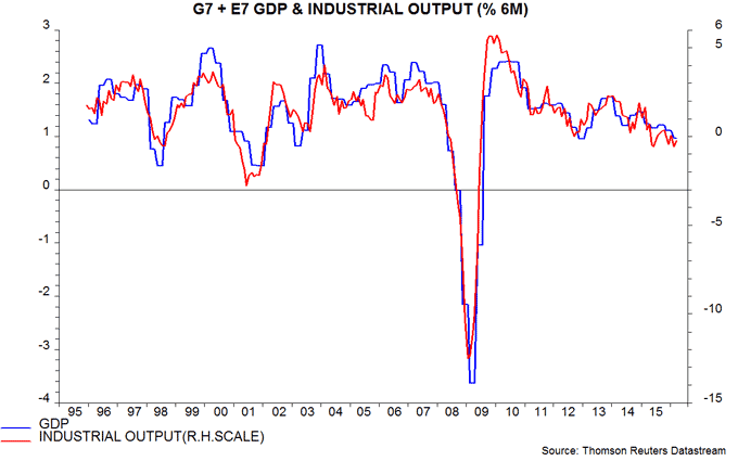
The second chart shows changes in industrial output and a G7 plus E7 leading indicator based on the OECD’s country data. Six-month growth of the indicator rose again in March, having bottomed in November 2015. The one-month indicator change also continues to firm.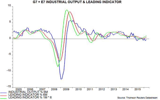
The upturn in leading indicator momentum is consistent with a rise in G7 plus E7 six-month real narrow money growth from a low in August 2015 – third chart. The latter pick-up was noted in a post at end-2015, which concluded that “global economic momentum will remain soft in early 2016 but rise in the spring / summer”. (Note that real narrow money has expanded consistently faster than industrial output / GDP in recent years, reflecting super-low interest rates, which have reduced the opportunity cost of holding demand / sight deposits and physical cash. Changes in real money growth, however, continue to foreshadow changes in economic expansion six to 12 months ahead.)
The stronger signal from the leading indicator mainly reflects an upturn in the E7 component, although G7 weakness is abating. The OECD’s Chinese leading indicator, in particular, is giving a positive message, consistent with an earlier upswing in real narrow money growth – fourth chart. A recent resurgence of pessimism about Chinese economic prospects appears premature, at least.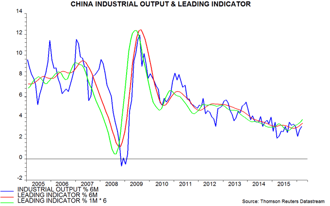
Is Chinese credit out of control?
China pessimists argue that the authorities’ efforts to stimulate the economy have resulted in another unsustainable credit boom. The credit surge, they claim, has merely delayed an economic downturn and increased its probable magnitude, while further weakening banks’ balance sheets. Are they right?
Widely-monitored credit / financing measures do not suggest a renewed lending explosion. Annual growth of renminbi bank loans to households and non-financial enterprises was 14.5% in March, close to its average of 14.9% over 2011-15 (five years). Annual growth of “total social financing” – a broader measure of fund-raising by households and non-financial enterprises encompassing non-bank loans and issuance of bonds, acceptances and equities – was 13.4%, significantly lower than its 2011-15 average of 17.3% and far below a 35% peak reached in 2009.
The pessimists, however, highlight a less widely-followed series measuring total domestic credit extended by banks. This rose by an annual 25.4% in March versus average expansion of 17.4% over 2011-15. Recent growth is the fastest since the 2009-10 credit boom – see first chart.
The big divergence between the growth of this measure and that of bank loans to households and non-financial enterprises reflects a surge in credit to the government and the non-bank financial sector. Bank credit to government, net of government deposits at banks, rose by an annual 87.4% in March, contributing 4.3 percentage points to the 25.4% growth of total domestic bank credit. Credit to the rest of the financial sector, meanwhile, rose by 68.3%, contributing 8.2 percentage points to total credit growth.
The increase in government credit is partly a consequence of fiscal stimulus. The authorities have responded to a weak economy by running an increased budget deficit financed through the banking system.
The government credit surge also reflects the impact of the local government debt swap programme, under which municipal authorities have been issuing bonds, mostly bought by banks, with the intention of retiring more expensive bank loans incurred by their subsidiary enterprises (local government financial vehicles). These subsidiaries are classified as “non-financial enterprises” so their borrowings are covered by the headline RMB bank loans and total social financing measures. To the extent that debt has been repaid, annual growth of these measures will have been “artificially” depressed, possibly by several percentage points. Even adjusting for such an effect, however, growth would not be particularly strong by the standards of recent years.
The rise in government credit, therefore, is unconcerning and may be serving to improve the quality of banks’ assets, since government lending has the implicit backing of the central authorities (unlike loans to local government financing vehicles).
The surge in credit to the non-bank financial sector is more worrying. An FT article this week suggested that banks have been using “investments” in intermediaries such as trust companies, brokerages and special purpose vehicles to hide risky loans to households and non-financial enterprises. Such investments or “debt receivables” are classified as credit to the financial sector. The FT stated that the banking regulator is cracking down on this practice and will require banks to make full provision for debt receivables based on loans.
However, while the acquisition of such investments has increased banks’ exposure to credit risk, it does not imply that the headline measure of total social financing growth fails to capture the full extent of credit expansion to households and non-financial enterprises. “Shadow” lending by non-bank financial intermediaries is already covered by this measure. The increase in bank investments in such intermediaries, therefore, represents previous shadow lending being transferred onto banks’ balance sheets, rather than an unrecorded new credit.
The rise in holdings of debt receivables appears to account for most but not all of the rise in bank credit to the financial sector. The FT article stated that total debt receivables grew by 63% to RMB 14 trillion last year, implying an increase of RMB 5.4 trillion. Bank credit to other financial enterprises, however, expanded by RMB 6.4 trillion during 2015.
It is likely that official efforts to support the stock market have also contributed to the rise in bank credit to the financial sector over the past year. More recently, banks may have been lending to finance speculation in bond and commodity markets.
To summarise,
1) Credit expansion to households and non-financial enterprises is moderate by the standards of recent years. The total social financing measure captures “shadow” lending, including lending by banks channelled through “debt receivables”.
2) Total bank credit growth has been boosted by fiscal expansion and, probably, the local government debt swap programme (assuming that part of the money raised by new bond issuance has yet to be used to repay previous debt).
3) It has also been boosted by the transfer of shadow system lending onto banks’ balance sheets. This arguably makes explicit an existing credit risk, rather than creating a new one.
Recent credit developments, therefore, are nuanced and the simplistic claim that a generalised boom is in full swing and will inevitably lead to a bust should be discounted.
The forecasting approach here uses narrow money trends to assess economic prospects. Six-month growth of real (i.e. inflation-adjusted) narrow money, as measured by “true” M1*, rose strongly from mid-2015 into January 2016 but fell back in February / March – second chart. The earlier strength suggests a recovery in economic growth through the late summer, at least. Narrow money trends would need to weaken significantly further to warrant a shift towards pessimism.
*”True” M1 = currency in circulation plus demand / temporary deposits of households and corporations. The official M1 measure excludes household deposits.


