Entries from May 1, 2014 - May 31, 2014
Global leading indicator up again, with EM component contributing
 Simon Ward
 2 Comments
As expected, the global longer leading indicator followed here rose further in March, consistent with the forecast that economic growth will strengthen over the summer after a lull in early 2014.
The leading indicator is designed to provide advance warning of turning points in global* six-month industrial output growth. Its lead time has averaged 4-5 months in recent cycles. The indicator fell between July and December 2013, signalling that industrial momentum would reach a peak in late 2013 and moderate in early 2014. The peak occurred on schedule in November-December, with growth slowing through March – see first chart.
The recovery in the indicator since December suggests that industrial output growth will bottom in April-May and rise through July-August (at least). This is consistent with monetary trends: global real narrow money expansion increased between November 2013 and February-March 2014 and usually leads the economic cycle by about six months.
The rise in the global indicator reflects improvements in both the G7 and E7 components. The latter runs counter to a widespread view that economic risks in emerging economies are rising, but fits with a recent modest revival in E7 real money expansion – second chart.
*Global = G7 developed and E7 emerging economies.


Chinese money trends turning positive
Chinese monetary trends suggest moderately stronger economic growth over the next six months.
Six-month expansion of real M2 fell between May and November 2013, signalling that the economy would lose momentum in early 2014, allowing for the usual half-year lead. Six-month industrial output growth fell sharply between December and March, with an April reading due tomorrow – see first chart.
Real M2 expansion, however, has been recovering since late 2013 and reached an 11-month high in April. Real M1 growth is softer but has also revived. The message is that the recent industrial slowdown is not a precursor to more significant weakness; economic momentum, instead, is likely to revive over the summer.
Real credit trends have also firmed modestly, although the broad “total social financing” measure is growing more slowly than a year ago – second chart.
The suggestion that economic prospects are improving at the margin is supported by a small rise in the new orders component of the manufacturing purchasing managers’ survey in April. Export performance, meanwhile, was better than expected last month.
Firmer Chinese signals are consistent with the forecast of a rebound in global industrial output growth from May through late 2014 – see previous post. Confidence in this forecast would be strengthened by confirmation that the longer leading indicator followed here rose in March – key component data are released tomorrow.


UK wage pressure indicators flashing red
The economic surprises of 2013 were the strength of growth from the spring and the speed of the decline in unemployment later in the year. Both had been suggested by a monetarist forecasting approach*. Better news has contributed to the consensus GDP growth projection for 2014 moving up to 2.8%**, close to the expectation here of “about 3%” based on monetary trends.
The next surprise could be a strong pick-up in wage and price pressures in late 2014 and 2015. This would fit with a two-year lead from money growth to inflation, as well as evidence that the economy is now operating above non-inflationary “potential”. The vacancy and short-term unemployment rates***, in particular, have moved through longer-term averages, indicating that labour market conditions are tight by historical standards. Real earnings growth is inversely correlated with the short-term jobless rate; it is much less sensitive to longer-term unemployment – see first two charts below.
Rising wage risks are confirmed by today’s Recruitment and Employment Confederation (REC) jobs report, showing that candidate availability is falling at the fastest pace for 10 years, with corresponding strong upward pressure on starting salaries for new permanent recruits. The final chart is taken from a recent speech by MPC member Ian McCafferty; the REC permanent salaries index climbed further last month and is close to the highs reached in 1998 and 2007. Whole-economy earnings growth is forecast here to rise to about 4% by the May 2015 election, contributing to the Conservatives moving into a poll lead versus Labour – see previous post.
*See, for example, here and here.
**Treasury survey of forecasters, April 2014.
***Short-term = unemployed for up to six months.


UK house prices not extended relative to rents (contra OECD)
The OECD claims that UK house prices “significantly exceed long-term averages relative to rents”. Really?
The OECD calculation compares the ONS house price index with the rents component of the RPI. These measures, however, are based on different “baskets” of houses. The OECD is comparing apples with pears.
Specifically, the ONS house price index is a value-weighted measure (i.e. giving greater weight to expensive houses) based on a survey of mortgage-financed transactions. It excludes public sector housing.
The RPI rents index, meanwhile, measures actual payments by tenants in both the private and public sectors. It is implicitly weighted towards lower value housing. Public sector rents (i.e. paid to housing associations and local authorities) account for nearly two-fifths of the index.
A far superior methodology is to compare national accounts data on aggregate rents – both actual and imputed to owner-occupiers – with the value of the housing stock. Assuming that the statisticians use appropriate methods for imputing owner-occupied rents, the two parts of the ratio will reflect the same mix of housing.
This national rental yield measure is regularly calculated here and signalled that house prices were about 30% overvalued at their peak in 2007 but had moved to significant undervaluation by end-2011. This contrasts with the OECD's claim that the price to rent ratio has remained above average in recent years.
What is the current message? The national rental yield was an estimated 4.52%* at end-2013 versus an average since 1965 of 4.26%, implying 6% undervaluation. Recent house price strength, in other words, has not been excessive relative to housing market “fundamentals”, which have simultaneously driven up rents.
Houses are expensive in terms of earnings but bubbles are characterised additionally by an overshoot of prices relative to rents, as rose-tinted perceptions of capital gains potential distort assessments of the merits of owning rather than renting. Current prices are still far from bubble territory, though could get there if monetary conditions remain excessively loose.
*The yield is calculated on a trailing 12-month basis, e.g. its end-2013 value equals rents in calendar 2013 divided by the December housing stock . The latter was estimated by linking the published end-2012 value to the change in the ONS house price index between December 2012 and December 2013.

US / Eurozone small firm credit conditions easing
The latest Fed and ECB bank lending surveys are consistent with the forecast here of solid global economic growth through late 2014.
The net percentage of banks easing credit standards on loans to smaller firms* tends to lead the economic cycle, though is less informative for forecasting purposes than real narrow money trends. The Eurozone indicator turned heavily negative ahead of the 2008 recession and rebounded before the 2009 recovery – see first chart. Behaviour around the 2011-12 recession was more coincident than leading (in contrast to real narrow money). The latest reading is consistent with respectable economic growth**.
The corresponding US series has a longer history and has correlated similarly well with the economic cycle, with the latest result again solid – second chart.
The forecast that six-month global industrial output growth will rise from a short-term low in May through late 2014 rests on faster real narrow money expansion since late 2013 and a more recent recovery in the longer leading indicator followed here. A final March reading of the leading indicator will be available on 13 May, with preliminary data suggesting another monthly increase – see previous post.
*Net percentage easing = net percentage tightening multiplied by -1. Larger firms are less reliant on bank lending.
**Eurozone banks are also asked whether they expect to ease standards next quarter; the net percentage was stable at a seven-year high in the latest survey.


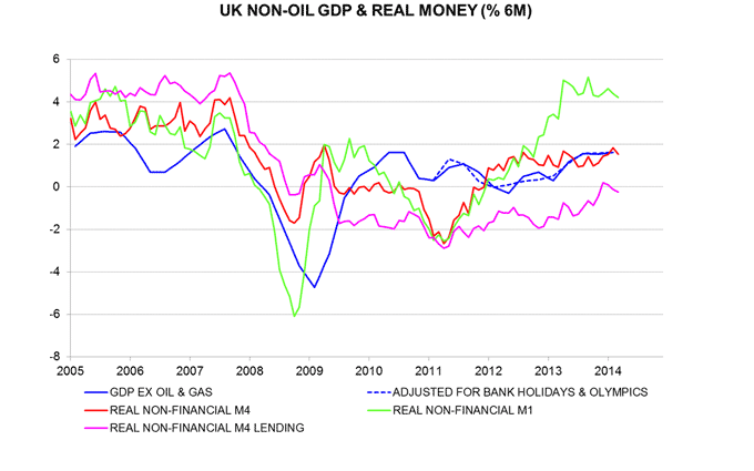
UK monetary conditions excessively loose
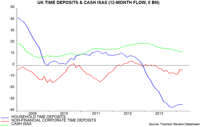
UK narrow money continues to expand rapidly, signalling stable, solid economic growth through late 2014. Households, meanwhile, are still withdrawing large sums from savings accounts in response to low deposit interest rates. This outflow is a direct consequence of Bank of England policy and may be contributing to excessive consumer spending and financial speculation / asset bubbles, with negative medium-term economic consequences.
Six-month expansion of real narrow money* moved from moderate to strong between mid-2012 and spring 2013, correctly signalling an upshift in economic growth from the start of last year, allowing for the usual half-year lead. It has since stabilised at a robust pace, with today’s March result continuing the trend – see chart. Quarterly GDP growth has been 0.7-0.8% in each of the last four quarters and is likely to be similar over the remainder of 2014.
Real broad money** expansion is also stable but at a subdued level by past standards. This has not prevented strong economic growth because the demand to hold broad money has fallen in response to low deposit interest rates.
Households, for example, put only £435 million into cash ISAs in March, the lowest since May 2011, while withdrawing £1.9 billion from time deposits. Such deposits have suffered a cumulative outflow of £34.2 billion over the last 12 months, equivalent to about 3% of household disposable income over the period – second chart.
Real broad credit remains stagnant, providing further proof of its irrelevance for short-run economic prospects. Arranged but undrawn credit facilities, however, have been rising, suggesting a gradual lending revival.
A monthly fall of 0.1% in the Bank’s favoured broad money measure, M4ex, may attract attention. This was, however, caused by the Debt Management Office issuing Treasury bills and borrowing in the repo market to finance a large gilt redemption. This operation is temporary and M4ex will expand as the borrowing is unwound.
*Real non-financial M1, i.e. currency and overnight deposits of households and non-financial firms deflated by consumer prices.
**Real non-financial M4.