
Entries from October 1, 2013 - October 31, 2013
UK house prices still inexpensive relative to rents
 Simon Ward
 1 Comment
A measure of the rental yield on residential property derived from the national accounts edged down in the second quarter but remains comfortably above its long-run average, suggesting that house prices are undervalued relative to rents.
The national accounts yield measure is calculated by dividing the sum of actual rental payments and imputed rents of owner-occupiers by the value of the housing stock. The yield is calculated on a trailing 12-month basis, i.e. its second-quarter value equals rents in the year to June divided by the end-June value of the housing stock.
The rental yield has averaged 4.26% since 1965, moving well below this level during the house price bubbles of the early 1970s, late 1980s and 2000s associated with monetary laxity overseen respectively by Chancellors Barber and Lawson and Bank of England Governor King (all subsequently awarded peerages).
The yield reached a low of 3.34% in the third quarter of 2007, suggesting that house prices were then overvalued by 28% relative to rents (i.e. the percentage deviation of 4.26 from 3.34). It has since risen steadily, reflecting a fall in prices in 2008-09 and sustained solid growth in rents.
The yield was an estimated* 4.84% at the end of the second quarter, consistent with house price undervaluation of 12%.
Houses remain expensive in terms of earnings but bubbles are characterised additionally by an overshoot of prices relative to rents, as rose-tinted perceptions of capital gains potential distort assessments of the merits of owning rather than renting. Government policies designed to stimulate home-buying are ill-advised but current prices are far from bubble territory.
*The value of the housing stock at end-June was estimated by linking a published end-December reading to the change in the ONS house price index between December and June.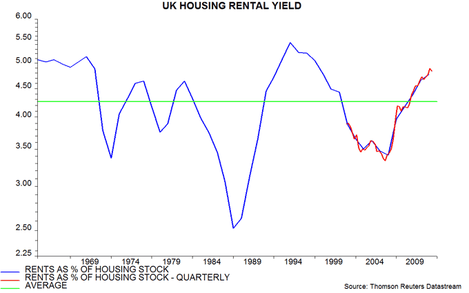
UK narrow money growth still surging; BoE asleep at wheel (again)
UK monetary statistics for September suggest that strong economic expansion will continue at least through spring 2014.
The forecasting approach here focuses on six-month growth of real narrow money, as measured by non-financial M1, comprising cash and sight deposits held by households and non-financial firms. This rose further to 5.3% in September, or 11.0% annualised – see first chart. Current growth is the highest since August 2004, ahead of an economic boom*.
Real non-financial M1 has been an excellent predictor of the economy in recent years, signalling the 2008-09 recession, 2010 rebound and 2011-12 “soft patch”, as well as this year's acceleration – first chart. The ECB this month published research showing that Eurozone real non-financial M1 has a “robust” leading relationship with GDP fluctuations. The Bank of England, by contrast, ignores the UK aggregate – it is a safe bet that no MPC member is aware of the recent surge.
Real non-financial M4, a broader measure also including time deposits and cash ISAs, grew by a moderate 1.2%, or 2.4% annualised, in the six months to September – first chart. M4 has displayed a looser relationship with the economy and is probably understating the degree of monetary stimulus at present, since the further large drop in deposit interest rates over the past year is likely to have depressed the demand to hold broad money. Put differently, the fall in rates has boosted the velocity of circulation of broad money – this is indirectly captured by the surge in M1.
Real narrow money growth is notably stronger than in the rest of the G7, suggesting that recent economic outperformance will continue – second chart.
The “monetarist” rule is that money supply changes affect economic activity in the short run but filter through to prices after about two years. The downside of recent monetary trends is that the current decline in inflation is likely to reverse from early 2014 in lagged response to faster money growth since 2011. The MPC may face a “crunch point” next spring as unemployment nears 7%, the housing market overheats and inflationary clouds darken.
*Gross value added excluding oil and gas rose by 5.3% in the year to the fourth quarter of 2005.


Eurozone September money numbers disappointing; Italy flashing red
Six-month growth in Eurozone-wide real non-financial M1* – the best monetary leading indicator of the economy** – slipped again in September, to its lowest since February. The decline from an April peak suggests that economic expansion will top out in the current quarter and slow in early 2014, allowing for the typical half-year lead – see first chart.
More worrying is the reemergence of a significant core / periphery divergence. Six-month growth in real M1 deposits in Italy, Spain and the three bail-out countries has fallen sharply, suggesting that a meagre economic recovery this autumn and winter will fizzle out by spring 2014 – second chart.
The peripheral slowdown mainly reflects deterioration in Italy, where real M1 deposits resumed contraction in the latest six months – third chart. Growth has eased and is unimpressive in Portugal and Spain but remains robust in Ireland and Greece – third chart.
Italian political chaos may be causing households and firms to rein back spending intentions while encouraging an outflow of capital – both would tend to depress narrow money growth. Italy’s Target2 deficit has rewidened since end-July, consistent with a turnaround in capital flows. An end-October update is due on 8 November.
Peripheral stock markets have sky-rocketed since early July and are up by 24% in dollar terms year-to-date, tying Japan at the top of the performance league table. This recovery was consistent with an earlier monetary revival but the latest statistics cast doubt on hopes of further gains.
*Non-financial M1 = physical cash and overnight deposits of households and non-financial corporations.
**See “Stylised facts of money and credit over the business cycle”, ECB Monthly Bulletin October 2013, pp18-22.


Strong UK growth confirmed; non-oil output 1.6% below peak in Q3
UK GDP is provisionally estimated to have risen by 0.8% in the third quarter versus a forecast here of growth of about 1%. Initial estimates tend to be revised up when the economy is accelerating – the increases in the first and second quarters have already been raised by 0.1 percentage points each (i.e. from 0.3% to 0.4% and from 0.6% to 0.7% respectively).
GDP in September alone was 0.3% above the quarter average, based on official estimates of sectoral output levels. Ignoring revisions, this implies that GDP would grow by 0.3% in the fourth quarter even if output levels were to stagnate after September; a more likely scenario of monthly expansion of 0.25% would produce another quarterly rise of 0.8%.
GDP growth of 1.5% combined in the second and third quarters has been driven by the private sector. Output of “government and other services” rose by only 0.3%, contributing a tiny 0.07 percentage points to the GDP increase.
GDP last quarter was still 2.5% below the peak in the first quarter of 2008 but this partly reflects a fall in North Sea oil and gas production – non-oil output was 1.6% below peak in the third quarter, with the shortfall likely to decline below 1% this quarter.
G7 inflation: a review and prognosis
Consumer price inflation in the Group of Seven (G7) major countries has been trendless over the last decade despite the upheavals in the economy and financial markets. Fluctuations in headline inflation have largely reflected movements in food and energy prices – see first chart. “Core” inflation was seemingly little affected by the credit boom and bust, and has since returned to a “normal” level by recent standards.

The post-crisis stability of core inflation has defied the predictions of both Keynesian “output gapologists” and monetary base inflationists. The gapologists claimed that the “great recession” had created large-scale spare capacity that would exert strong downward pressure on inflation, perhaps even causing prices to fall. The monetary base adherents, by contrast, argued that central bank “money-printing” on a large scale would, by the law of supply and demand, result in significantly higher inflation after 1-2 years. The failure of these forecasts is discussed later.
A very long-term perspective is provided by the Kondratyev or long cycle in inflation. There is evidence extending at least back to the 18th century that price pressures reach a major peak every 50 or so years – second chart. The cycle shows up in the price level before World War 2 and inflation thereafter, the change, presumably, reflecting the transition to a pure fiat monetary system. The last major global inflation peak occurred in the mid 1970s, suggesting that – based on its average 54-year length – the cycle bottomed in the early 2000s and is now in another upswing phase that will reach a crescendo in the mid to late 2020s.

Tony Plummer, the author of Forecasting Financial Markets, has analysed the Kondratyev cycle in detail, decomposing its upswings and downswings into a series of shorter-term cycles. According to Mr. Plummer, the cycle template implies that inflation will rise over 2014-16 but fall back again later in the 2010s. The surge to the next Kondratyev peak in the mid to late 2020s is scheduled to begin only after 2019. This would be consistent with the last three cycles, in which prices / inflation have taken off only in the final decade of the upswing – second chart.
Returning to recent performance, forecasts that inflation would fall significantly in the wake of the great recession were based partly on estimates produced by the OECD and other bodies suggesting a large shortfall of output relative to supply capacity. Core inflation seemed to display a strong relationship with such output gap estimates before the crisis, rising or falling depending on whether the deviation was positive or negative – third chart. This relationship, however, broke down in 2011, with inflation picking up despite claimed large-scale excess capacity.

The view here is that G7 output is currently broadly aligned with supply capacity – there is no significant negative output gap. The estimates produced by the OECD and others are little more than statistical guesswork, based on extrapolating the long-term trend in output. They neglect changes to demand patterns and relative costs that have rendered some capacity uneconomic. The Austrian view, in other words, is correct – part of the growth of the 2000s represented a temporary expansion of output due to demand and supply distortions created by the credit bubble. This temporary rise has now reversed.
The proposition that the output gap is negligible is supported by business survey evidence. The fourth chart compares the OECD’s estimate of the US gap with a weighted average of manufacturing and non-manufacturing operating rates from the ISM’s semi-annual survey. A correlation before the great recession has broken down, with the ISM survey suggesting that operating rates have been close to normal since late 2011.
The fifth chart shows a similar presentation for the UK, using data from the British Chambers of Commerce survey on the percentages of manufacturing and services firms working at full capacity. The suggestion is that the true UK output gap is now positive, while the gap turned negative only briefly in 2009-10.


The gapologists, of course, are undaunted by their forecasting failure, making only minor revisions to their gap estimates while claiming that the disinflationary impact has been temporarily delayed by commodity price shocks and slow reallocation of unused labour and capital due to a shortage of credit.
Similar intransigence is displayed by adherents of the view, particularly popular among gold investors, that large-scale monetary base expansion due to US / UK / Japanese QE and ECB “liquidity operations” would by now have pushed inflation significantly higher. This view has proved wrong for the simple reason that there has been very limited pass-through from the monetary base to the narrow money supply (i.e. physical cash in circulation plus instant-access bank deposits) and even less to broad money (which additionally includes time deposits, savings accounts and money market funds) – sixth chart.

A key point is that the reserves created by central banks to finance QE and lending to banking systems are not part of the “money supply”, in the sense of the stock of liquidity held by households and firms. This stock increases if the central bank actions induce commercial banks, in aggregate, to expand their balance sheets* – the money supply mostly consists of commercial bank liabilities, which rise and fall in line with assets. In practice, QE has resulted in banks substituting central bank reserves for holdings of government securities and private sector lending. The boost to the aggregate balance sheet – and so to the money supply – has, therefore, been small. This explains why QE has been so disappointing in terms of its impact on the economy, as well having little effect on inflation. (This is not to argue that QE has been unimportant in other respects – it has facilitated the financing of large budget deficits while artificially lowering long-term bond yields and inflating equity and property valuations by suppressing the discount rate used to value future earnings.)
While the claimed causal link between the monetary base and inflation has been disproved, the traditional “monetarist” relationship between the money supply itself and price pressures remains intact. According to the Friedmanite rule, inflation fluctuations follow those in money supply growth with a long and variable lag averaging about two years. The seventh chart attempts to pair turning points in G7 inflation and narrow money growth over the last 25 years. There is clear evidence in favour of the rule, when interpreted directionally and with allowance for lag variability. The relationship, moreover, has survived the great recession.

The eighth chart shows the same data over a shorter period and with a two-year lag applied to money growth. The Friedmanite relationship predicted both the fall in inflation into 2010 and the subsequent rebound that confounded the gapologists. It suggests that inflation is about to embark on another short-term upswing, consistent with Mr. Plummer’s forecast based on his analysis of the internal structure of the Kondratyev wave.

The final chart shows the relationship of inflation and house prices. A rise in money growth typically boosts financial and property markets before flowing through to higher goods and services inflation. House price developments, therefore, may provide early warning of future inflation trends. The chart applies an 18-month lag on house price changes; the suggestion, again, is that inflation will rise in 2014.

To sum up, the monetarist relationship, cycle analysis and house price developments point to a rise in inflation in 2014-15. The opposing view that excess capacity will bear down on price pressures ignores supply-side weaknesses and is inconsistent with survey evidence. The coming inflation rise is unlikely to be the start of a multi-year surge; inflation may fall again after 2015 in response to another economic downswing. The long cycle suggests a 1970s-style inflation crisis in the 2020s, a scenario for which the foundations are arguably being laid by an ongoing rise in government debt and a shift in monetary policy priorities from price stability to unemployment targeting.
*Assuming no change in non-money liabilities.
UK services turnover booming
Services turnover figures for July and August suggest that GDP rose by about 1% in the third quarter – a preliminary official estimate will be released on 25 October.
Annual growth in turnover value was 11.0% in July / August combined, up from 10.0% in the second quarter. This suggests that the quarterly increase in services output volume last quarter at least matched that a year earlier, in the third quarter of 2012. The latter rise was 1.0%, partly reflecting the Olympics boost.
A 1.0% rise in services output would contribute 0.8 percentage points (pp) to quarterly GDP growth. Output data for industry and construction for July / August are consistent with the two sectors adding about 0.2 pp, for a GDP gain of 1.0%.
Such growth would be above the consensus estimate of 0.8% but would be consistent with the strength of recent business surveys and labour market data. It is, of course, possible that the Office for National Statistics will issue a lower preliminary number that is subsequently revised up.
