UK GDP rebound trumped by deflator weakness
 Simon Ward
 Post a Comment
“Gangbusters” UK GDP growth of 0.6% in Q1 may partly reflect inadequate adjustments for the leap year and early timing of Easter. In any case, the bigger story in recent national accounts data is nominal deceleration.
Nominal GDP rose at an annualised rate of 2.1% in Q4 and Q1 combined, down from 6.3% in the prior two quarters. With output momentum recovering slightly, the slowdown reflected a sharp fall in the rate of increase of the GDP deflator, from 6.6% annualised to 1.5% – see chart 1.
Chart 1

The drop in two-quarter nominal GDP momentum was signalled roughly a year ahead by falls in six-month broad and narrow money momentum into negative territory – chart 2. Money momentum has recovered since Q3 2023 but on both measures remains weaker than during the 2010s, when the GDP deflator rose at an average 1.8% pace.
Chart 2

As an aside, the latest Monetary Policy Report contains a lengthy discussion of monetary developments and their relevance for policy. The strategy, as usual, is to damn with faint praise. While “broad money growth and inflation appear to have moved together over long cycles … it is harder to take an unambiguous signal about inflationary pressures from growth in the aggregate money data in isolation over shorter, policy-relevant, horizons.”
Really? Study chart 2. A directional leading relationship in rates of change is obvious. Except around the initial Covid lockdown, there are no examples of money momentum giving a seriously misleading message about future nominal GDP developments. As well as signalling the 2021-22 inflation surge, money trends warned of economic weakness / falling price pressures in 2008-09 and 2011-12, while contradicting recession forecasts following the Brexit referendum result. “Monetarists” were on the right side of the policy debate on all these occasions.
The income analysis of GDP allows movements in the GDP deflator to be attributed to changes in labour costs and broadly defined profits per unit of output. How has the recent sharp slowdown been achieved given supposedly sticky wage pressures?
According to the national accounts numbers, employee compensation per unit of output rose at an annualised rate of 1.8% in Q4 / Q1, down from 6.9% in the prior two quarters – chart 3. This slowdown is consistent with official earnings data and reflects a combination of 1) a moderation in regular earnings momentum, 2) a fall in bonus payments and 3) a pick-up in productivity (i.e. output per worker) as employment fell.
Chart 3

Profits and other “entrepreneurial” income per unit of output, meanwhile rose by only 1.1% annualised in the latest two quarters, versus 6.3% in Q2 / Q3 2023.
Domestic cost developments, therefore, are compatible with the inflation target while money growth, although recovering, remains too low. The “monetarist” view is that the MPC is behind the curve – again.
Is US money growth stalling?
A post in February argued that US Treasury plans to reduce reliance on bills to fund the deficit implied weaker monetary expansion from Q2, with possible negative implications for markets and economic prospects. This scenario remains on track.
The Treasury last week confirmed a reduction in the stock of Treasury bills in Q2 while signalling small-scale issuance in Q3.
Deficit financing via bills rather than coupon debt tends to boost the broad money stock because bills are mostly bought by money-creating institutions, i.e. banks and money funds. Their purchases are usually associated with expansion of their balance sheets, with a corresponding increase in monetary liabilities.
Broad money also tends to rise when the Treasury finances the deficit by running down its cash balance at the Fed.
Both effects were in play in 2023 / early 2024, resulting in a large monetary boost from Treasury operations that more than offset the Fed’s QT – see chart 1.
Chart 1

The latest Treasury estimates, however, imply a small negative impact in Q2 / Q3 combined. The earlier post argued that the Fed would need to halt QT to offset this shift. Last week’s taper announcement was insufficient, implying that the combined Treasury / Fed influence is likely to turn significantly contractionary – chart 2.
Chart 2

Will a revival in bank lending neutralise the Treasury / Fed drag? The Fed’s April senior loan officer survey was less negative but demand and supply balances remain soft by historical standards, arguing against a strong pick-up – chart 3.
Chart 3

April monetary statistics will be released in late May but weekly numbers on currency, commercial bank deposits and money funds are consistent with emerging weakness – chart 4.
Chart 4

US core inflation: staying optimistic
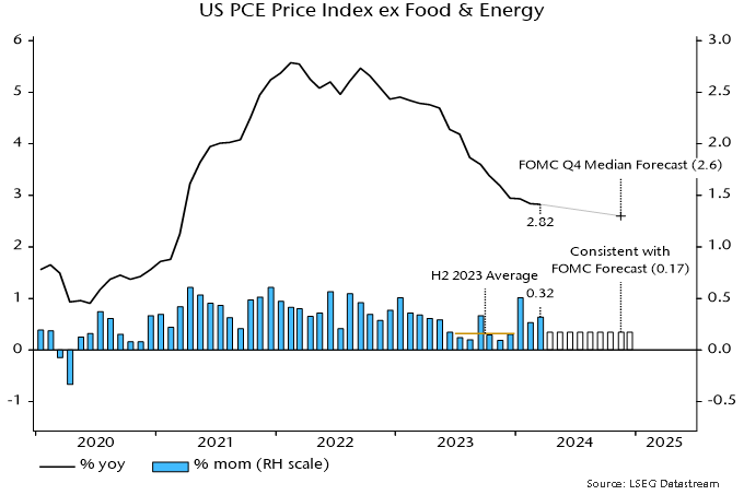
The Fed’s preferred core price measure – the PCE price index excluding food and energy – rose by an average 0.36% per month, equivalent to 4.4% annualised, over January-March.
The FOMC median projection in March was for annual core inflation to fall to 2.6% in Q4 2024. This would require the monthly index rise to step down to an average 0.17% over the remainder of the year – see chart 1.
Chart 1
The judgement here is that such a slowdown is achievable and could be exceeded, based on the following considerations.
First, such performance was bettered in H2 2023, when the monthly rise averaged 0.155%, or 1.9% annualised, i.e. the requirement is within the range of recent experience.
Secondly, the monetarist rule of thumb of a two-year lead from money to prices suggests a strong disinflationary impulse during H2 2024. From this perspective, any current “stickiness” may reflect the after-effects of a second pick-up in six-month broad money momentum in 2021, following the initial surge into mid-2020– see chart 2.
Chart 2
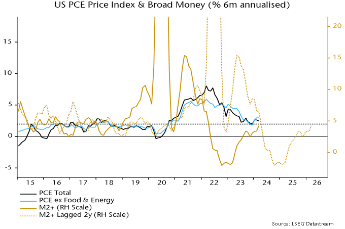
Momentum returned to a target-consistent 4-5% annualised in April 2022, subsequently turning negative and recovering only from March 2023, with the latest reading still sub-5%. Allowing for the usual lag, the suggestion is that six-month price momentum will move below 2% in H2 2024, remaining weak through next year.
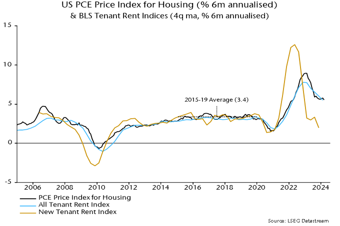
A third potential favourable influence is a speeding-up of the transmission of recent slower growth of timely measures of market rents to the PCE housing component. Six-month momentum of the latter was still up at 5.6% annualised in March but weakness in the BLS new tenants rent index through 2023 is consistent with a return to the pre-pandemic (i.e. 2015-19) average of 3.4% or lower – chart 3. With a weight of 17.5%, such a decline would subtract 3 bp from the monthly core PCE change.
Chart 3
Assessing UK house price valuation: a real yield-based approach
UK house prices were an estimated 52% expensive relative to history at the end of 2023, based on a comparison with rents and the real yield on index-linked gilts, a competing inflation-protected asset.
The degree of overvaluation is below previous extremes and does not imply that house prices need to fall by an equivalent magnitude, or even at all – the deviation could be eliminated by rental growth and a reversal of the recent rise in real yields.
The ratio of the average house price to average earnings is conventionally used to assess valuation. Chart 1 shows an economy-wide version of this ratio – the estimated value of the housing stock divided by aggregate household disposable income.
Chart 1
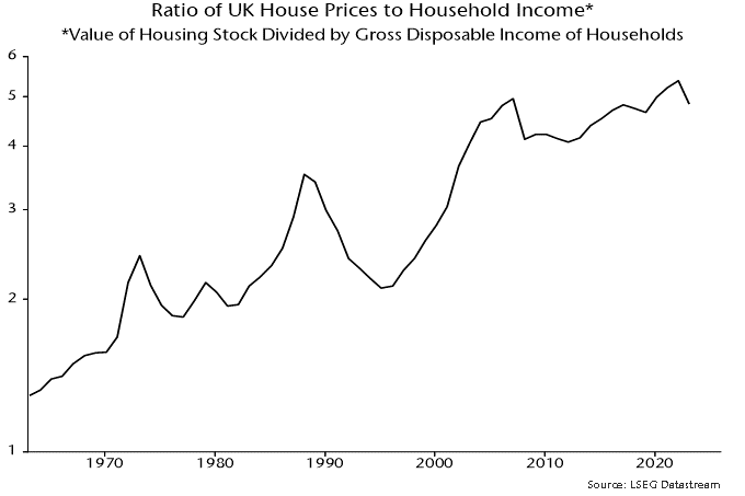
The secular rise in the ratio is usually ascribed to such factors as increasing credit availability, population growth and undersupply due to planning and other constraints.
The use of earnings as a yardstick is questionable: it would be odd to assess the valuation of an equity market by reference to the income of investors. A better approach is to compare house prices with the value of services provided – proxied by rents – using an appropriate discount rate.
A simple valuation metric based on this approach is the gap between the rental yield on housing and the real yield on longer-term index-linked gilts. Index-linked rather than conventional bonds are the appropriate reference because housing is expected to provide inflation protection over the longer term.
The rental yield series, shown in chart 2, is derived from national accounts data by dividing the sum of actual and imputed rents by an estimate of the value of the housing stock*. The measure, therefore, is comprehensive, including owner-occupied and public housing as well as private rented accommodation.
Chart 2
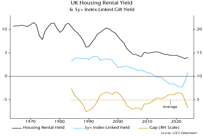
The index-linked yield series starts in 1983 – the first such gilt was issued in 1981 – so the rental / index-linked yield gap has 41 years of history. In contrast to the house price to income ratio, the gap appears to be stationary / mean-reverting. The average (mean) gap over this period was 4.96 pp. The deviation from this average is the basis of the estimate of over- / undervaluation in a particular year.
The gap indicates that housing was undervalued as recently as in 2021 but only because index-linked yields had fallen to a record negative.
The drop in the yield gap to an estimated 3.27% at end-2023 – implying housing overvaluation of 52% – was driven by index-linked yields returning to positive territory. The rental yield was little changed between 2021 and 2023.
Current overvaluation compares with prior extremes of 74% in 2007 and 105% in 1988 – chart 3. These extremes marked peaks of the 18-year housing cycle, with another top due around 2025.
Chart 3
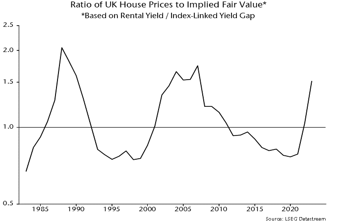
The suggestion is that, unless index-linked yields revert to negative, housing will perform poorly relative to history over the longer term, although prices may be supported over the next 1-2 years as the housing cycle upswing crests.
*The current series for actual and imputed rents begin in 1985; earlier numbers were estimated by linking to previous vintages. The value of the housing stock was calculated by adding the value of dwellings and an estimate of the value of associated land. The latter estimate was derived by applying the ratio of land value to dwellings value for households to the value of dwellings owned by all sectors. The resulting series begins in 1995; earlier numbers were estimated by linking to a previous vintage series for the value of the residential housing stock including land.
Is the UK MPC already too late?
A modest upside inflation surprise in March has been portrayed as confirming that inflationary pressures remain sticky, warranting further delay in policy easing.
The stickiness charge is bizarre in the context of recent aggregate data. The six-month rate of change of core consumer prices, seasonally adjusted, has fallen from a peak of 8.4% annualised in July 2023 to 2.4% in March – see chart 1.
Chart 1
Six-month momentum, admittedly, has moved sideways over the last four months. This mirrors a pause in the slowdown in six-month broad money growth in early 2022, with the relationship suggesting a resumption of the core downtrend from around May.
Claims of stickiness focus on measures of core services momentum. Such measures gave no forewarning of the inflation upswing and are unsurprisingly also lagging in the downswing.
“Monetarist” theory is that monetary conditions determine trends in nominal spending and aggregate inflation, with the goods / services split reflecting relative demand / supply considerations.
Global goods prices have been under downward pressure because of rising supply and falling input costs (until recently), resulting in a diversion of nominal demand and pricing power to services.
So a monetarist forecast is that a recovery in goods momentum is likely to be associated with faster services disinflation within a continuing aggregate inflation downswing.
A subsidiary argument to the sticky inflation view is that the MPC can afford to be cautious about policy easing because the economy is regaining momentum.
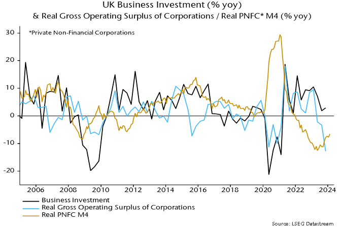
Monetary trends have yet to support a recovery scenario. Of particular concern is a continued contraction in corporate real money balances, which chimes with weakness in national accounts profits data and suggests pressure to cut investment and jobs – chart 2.
Chart 2
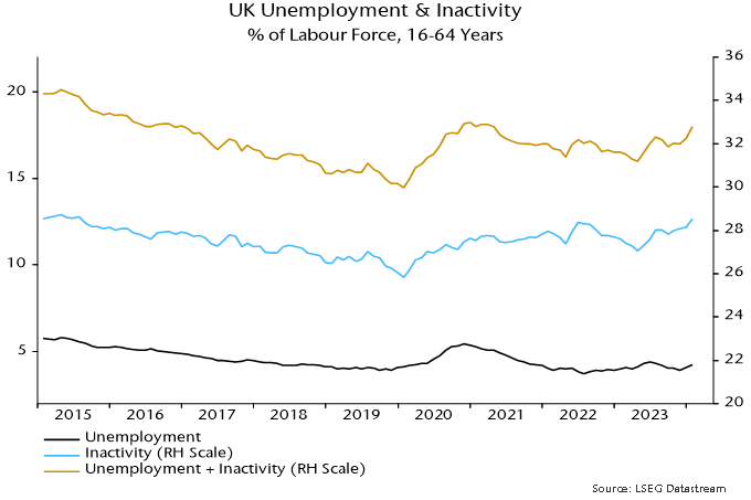
The latest labour market numbers hint at negative dynamics. LFS employment (three-month moving average) fell sharply in December / January and is now down 346,000 from a March 2023 peak. Private sector weakness has been partly obscured by solid growth of public sector employment – up by 140,000 or 2.5% in the year to December.
Ugly unemployment headlines have been avoided only because of a sharp fall in labour force participation. The unemployment rate of 16-64 year olds would have risen by 1.2 pp rather than 0.3 pp over the last year if realised employment had been accompanied by a stable inactivity rate – chart 3.
Chart 3
Claims of labour market resilience rest partly on the HMRC payrolled employees series but this fell for a second month in March, although numbers are often revised significantly. (A previous post argued that this series has been distorted upwards by rising inclusion of self-employed workers in PAYE.)
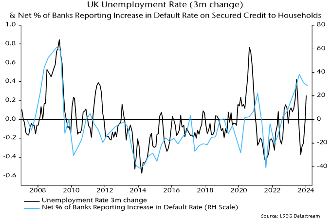
A recent revival in housing market activity, meanwhile, could prove short-lived unless mortgage rates resume a downtrend soon. The latest Credit Conditions Survey signalled that banks plan to expand loan supply in Q2 but the balance (seasonally adjusted) expecting stronger demand fell back sharply – chart 4. Majorities continue to report and expect higher defaults, consistent with gathering labour market weakness – chart 5.
Chart 4
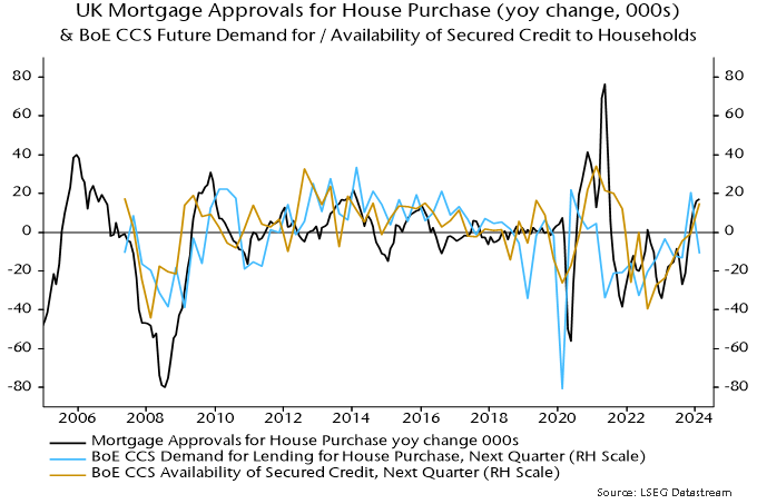
Chart 5